

Project Overview
Year
2022
Duration
6 Months
Tools Used
Figma
Zeplin
Shortcut
Scope
Responsive Website Designs
Gaming Controls
Design System
Background
Business Goal
Design Objective
Design process
- Define Goals
- User Testing
- Secondary Research
- Design Prototype
1. Define Goals
Business Goals vs. User Goals

User Interviews

Personas

2. User Testing
User Testing
Users from a variety of age groups and tech-levels were observed and interviewed while using the mobile site, and were asked to navigate in the world and try out the menu items. I used the following instructions for virtual user tests.

For in-person tests, I made sure to take photos of bugs that occured and hand posture.

Takeaways
Users held the device vertically by default, often holding the phone with the left hand and using the right for movement and view
It took a minute of navigating for some to realize they could move the view around; one didn’t discover this function at all.
Different browsers and devices and parcel activity levels created random reloading and other bugs creating great frustration among some.
Some menu elements felt small and inconsistent, lowered trust in functionality.
Sound didn’t seem to function.
Users conflicted when using the chat feature to hit RETURN or DONE to send.
Communicate Development Issues
3. Secondary Research
Competitive Analysis
MinecraftLego StarwarsMadout2SkyOceanhorn 2

Commonalities included, translucent or outlined UI, and increased reliance on gestures, as well as horizontal orientation.
I also turned to video game controllers from the 80s until today for inspiration of familiar design patterns... and considered other designers’ 2D representations made for the touchscreen.

I condensed all of the navigation attributes into a few different categories to consider, and offered reasoning for and against each solution for my client's product.

5. Design Prototype
Design Navigation


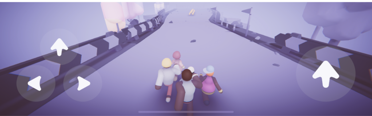
I decided the toggles took up too much visual space and tested just wheel and directional options. The wheel option was modern and attractive but slightly less usable and a bit more complex, therefore I continued to narrow down the directional options for size, color, and opacity.

I designed buttons using gaming historical convention to keep the "fly" button on the right side and the movement controls on the left. I made sure to use icons to promote accessibility.
Most backgrounds are darker but I checked my designs with fringe cases of pure black and white for visibility.

After considering these different options, I settled on the "fly" button below since it matches the desktop interface style which promotes brand continuity. "Third person view" and "chat " buttons were also tucked into the hamburger menu to create more space to view the world.
I also added an animated marker in the upper right quadrant of the screen that would let the user know they could user their finger to look around to add discoverability to this function.

Design Menu
A hamburger menu made sense for mobile web since it is more compact. I went about designing an all new menu that would have all the same information packed into the old navigation bar. I also favored the new brand color purple into the design over the muted magenta to add brand continuity and minimalism.
I also created a new design for the "Womps" button that I felt could accurately portray what Womps are to those less familiar with this Voxels-specific jargon--they are photos or screenshots taken in-world that are linked to your account and the locations on the map!

These are the final screens, and feel free to click through the menu in the prototype below.

.svg)
.svg)
.svg)