
Project Overview
Year
2021
Duration
80 Hours
Tools Used
Figma
OptimalSort
Procreate
Scope
Responsive Website
Branding
Prototype
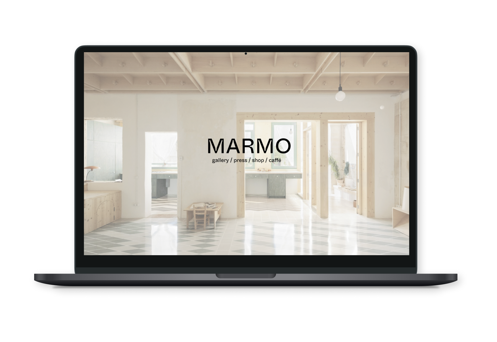
Background
Marmo Gallery has a building but yet to open in small coastal town, USA. Previous iteration of business known as Desuetude had modest success in nearby city but has been been closed for the past year. The owners of the gallery plan to have restaurant, bar, and cafe to support gallery. They also operate a publishing house, but they are keeping the name Desuetude for this avenue of the multifaceted business.
Business Goal
Increase brand awareness & establish identity in the context of a global art scene.
Design Objective
Instill trust and positive reputation in brand by creating simpler and more cohesive browsing experience, while maintaining core aesthetic brand fixtures.
Design process
- Research (Research Goals, Interviews, Persona, Empathy Map, Feature Roadmap)
- Define (Card Sorting, Preliminary Sketches Site Map)
- Design (UX) Task Flows, User Flows, Wire Frames
- Design (UI)Brand Style Tile, Responsive UI Design, UI Kit
- Implementation (High-Fidelity Prototype)
1. Research
Competitive Analysis
What worked: Whitespace, stark contrast accentuated by colorful photos an effective approach.
What didn't work: Usability or hierarchy often ignored for aesthetic appeal.
What didn't work: Usability or hierarchy often ignored for aesthetic appeal.
User Testing Interviews
- Liked the minimalist black and white color pallette and found it "fitting for a gallery"
- Would like to see more photos, preferably of exhibits installed
- Navigation felt "disjointed" and "jarring"
- Some fonts were pointed out to be way too large
- Said fonts felt unpredictable, oversize, or hard to read, and felt themselves "zoning out"
- Were confused by Italian terminology, leading to decreased confidence in usability.
Stakeholder Interviews
- I learned the chartreuse brand color was very important.
- Inktrap typeface liscence had been purchased, and was preferred to be used.
- Stakeholder indicated an intended brand differentiation between Gallery + Publishing house sites (www.gallerymarmo.com) versus Shop + Café pages, where were under a separate domain (www.bottegamarmo.com).
2. Define
Persona
I used anecdotes from my interviews to craft a persona as someone who is interested in new galleries, especially when recommended from a peer.
Artist and appreciator, Jordan loves to look at galleries her peers are showing at, and sometimes likes to shop unique items!

Card Sorting
I wrote down all the pages on the current site onto index cards and asked users to sort them into piles. Using this data, these were the patterns that developed. When restructuring the information architecture, this was an invaluable tool for me.

3. UX Design
Site Map
Using these buckets I made major categories for my site. However I thought these were too many pages for a global navigation, so I condensed these further as I went on to my user flow.

User Flow
Purchasing an insurance package is the most important and most direct flow of the product. In this flow, the user
searches for insurance, navigates to our landing page, enacts the primary call to action resulting in conversion.
searches for insurance, navigates to our landing page, enacts the primary call to action resulting in conversion.

4. Branding & UI Design
Branding & Logos
The cow head logo was iterated until I had something recognizable and scalable - friendly but not overly youthful.

Style Guide

